Foxglove Agent
An AI agent that helps robotics engineers work with their data in plain language.
Designing the Foxglove Agent.
Foxglove is the data platform robotics teams use to record, search, and visualize what their robots see and do. I led design for the Foxglove Agent, which launched in August 2026. Engineers can now ask questions about their data, build layouts, write user scripts, and search their recordings by describing what they want. We went from first prototype to launch in three months.
Year: 2026
Role: Director of Design, Foxglove
Focus: Product strategy, Agent UX, Search
Team: PM, Staff Product Designer, 8 engineers
This was the first set of AI features for Foxglove, so the goal for the initial release was to learn what customers wanted from AI. We started with two obvious wins for users: building layouts faster, and writing search queries in natural language.
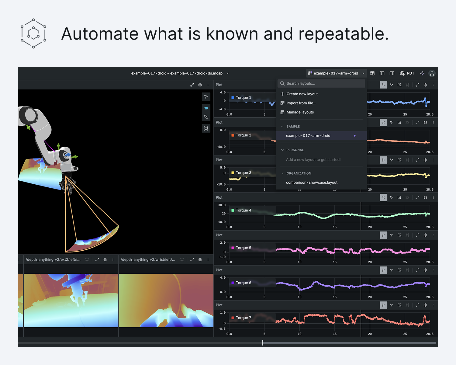
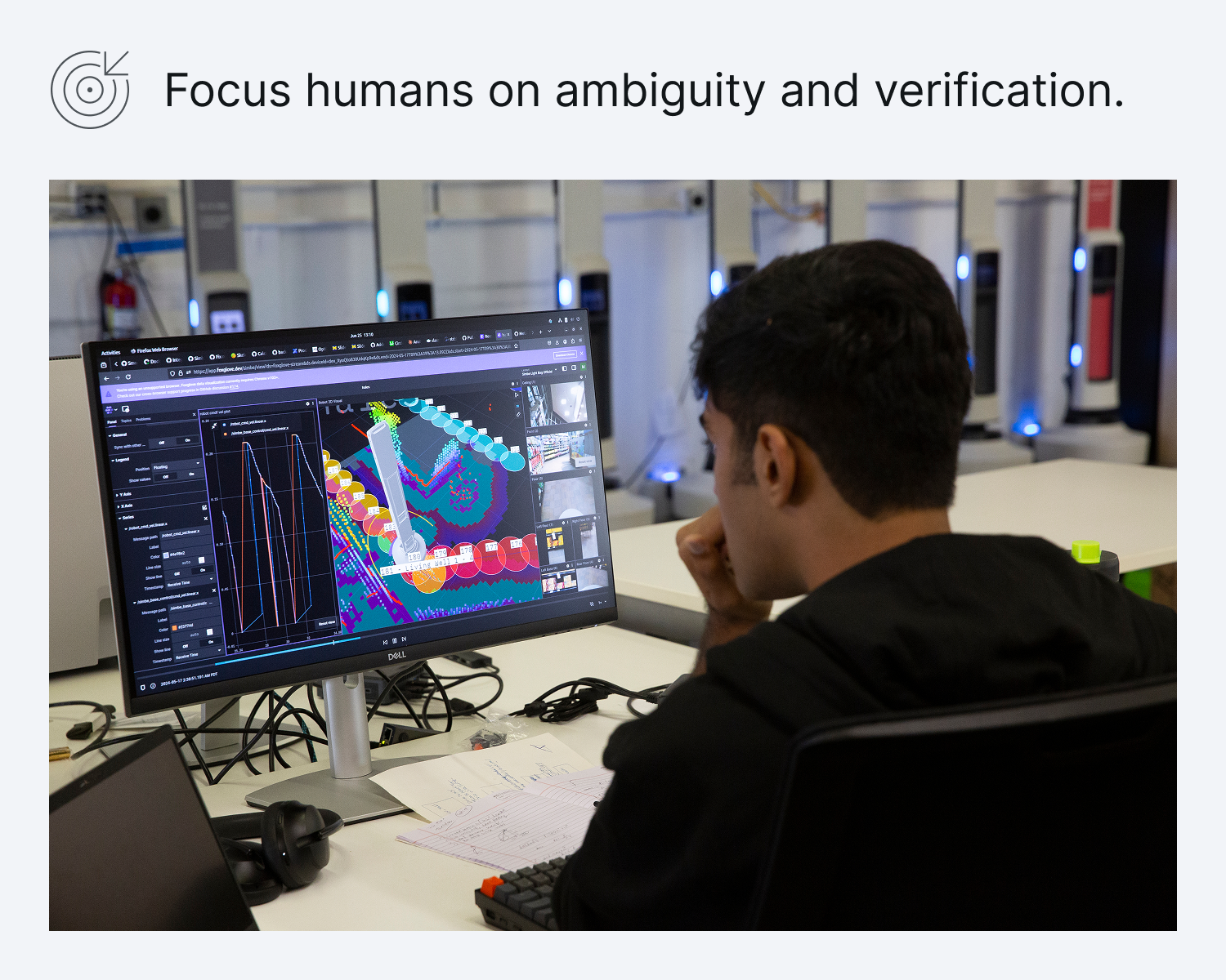
To me, agentic means the user states a goal and the system works out the steps to reach it. The user’s job shifts from operating to supervising. My approach is to automate what is known and repeatable, and let people focus on ambiguity and verification.
The problem.
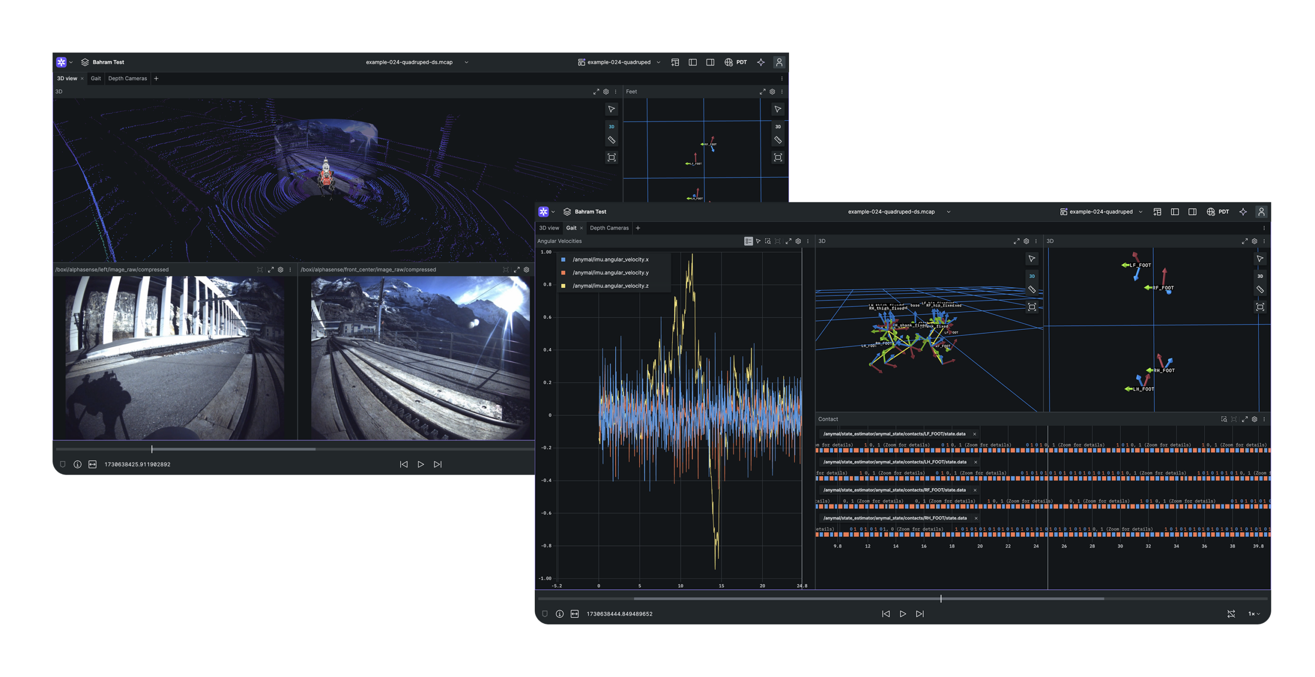
Layouts are saved workspaces engineers use to visualize robot data: panels for camera feeds, lidar point clouds, plots, and logs, each configured to the right topic. Engineers build layouts to explore, debug, or try something new, and then they discard most of them.
A complex layout took about an hour for an engineer to create. They had to review the topic list, find what’s relevant, add panels, configure fields, and finally view the scene. Sometimes engineers know what they want. Sometimes they don’t know what’s in the recording and have to dig through the data first.
Where the agent lives.
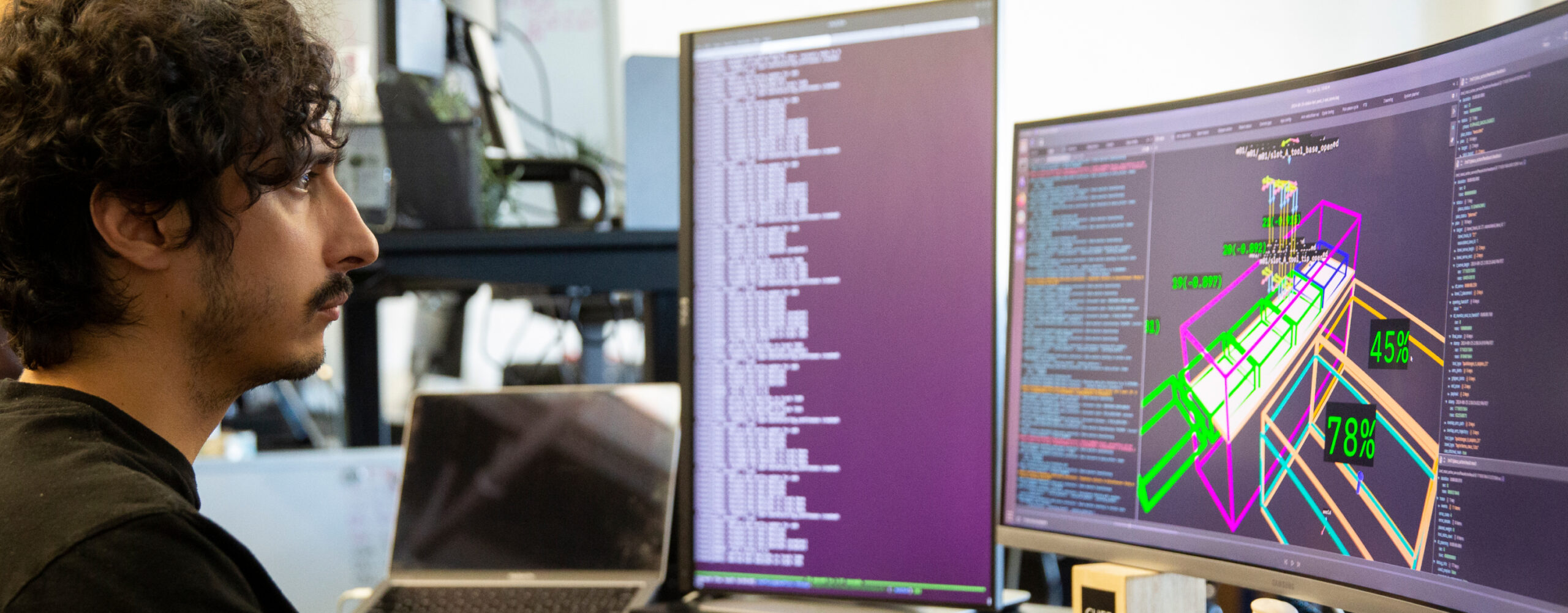
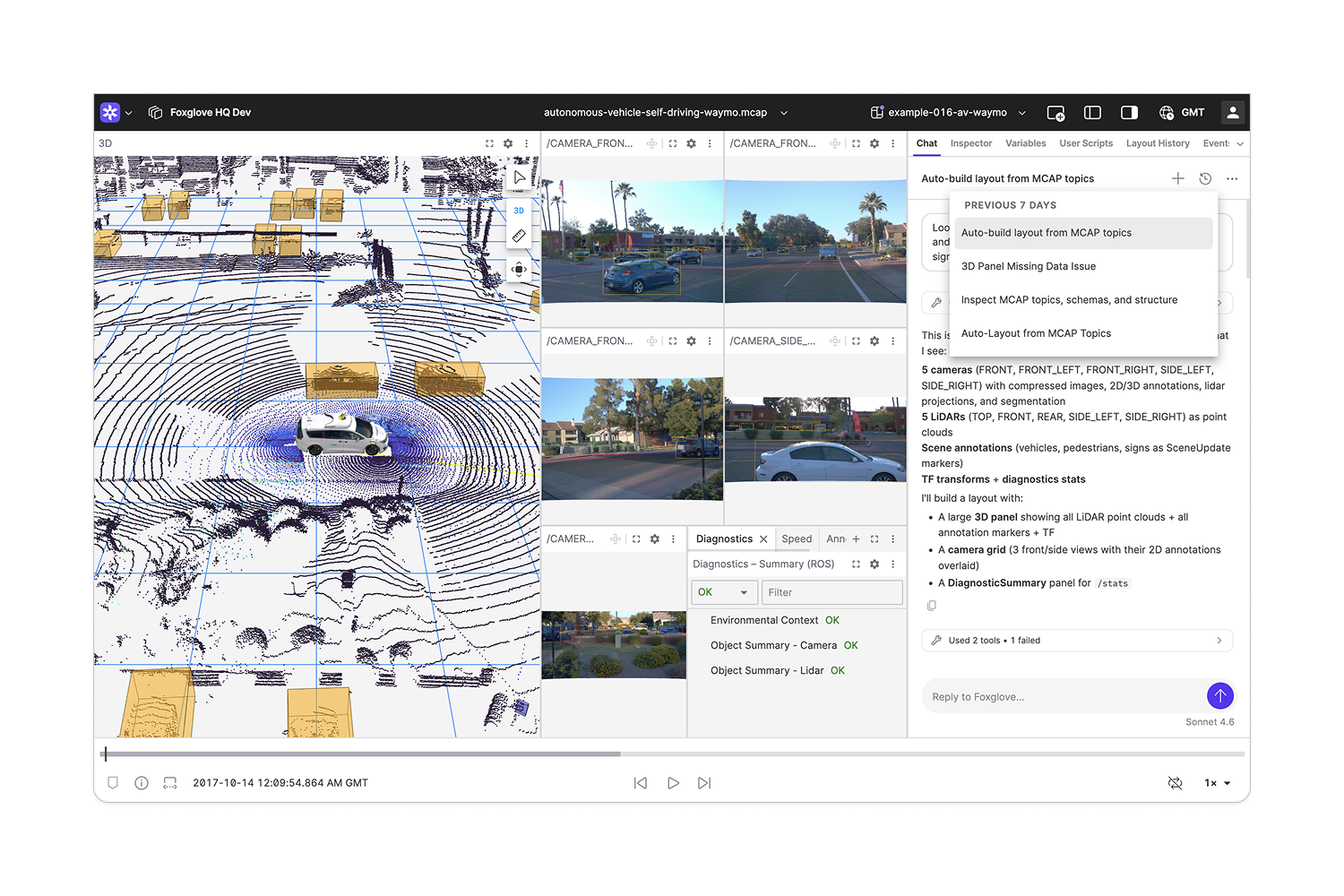
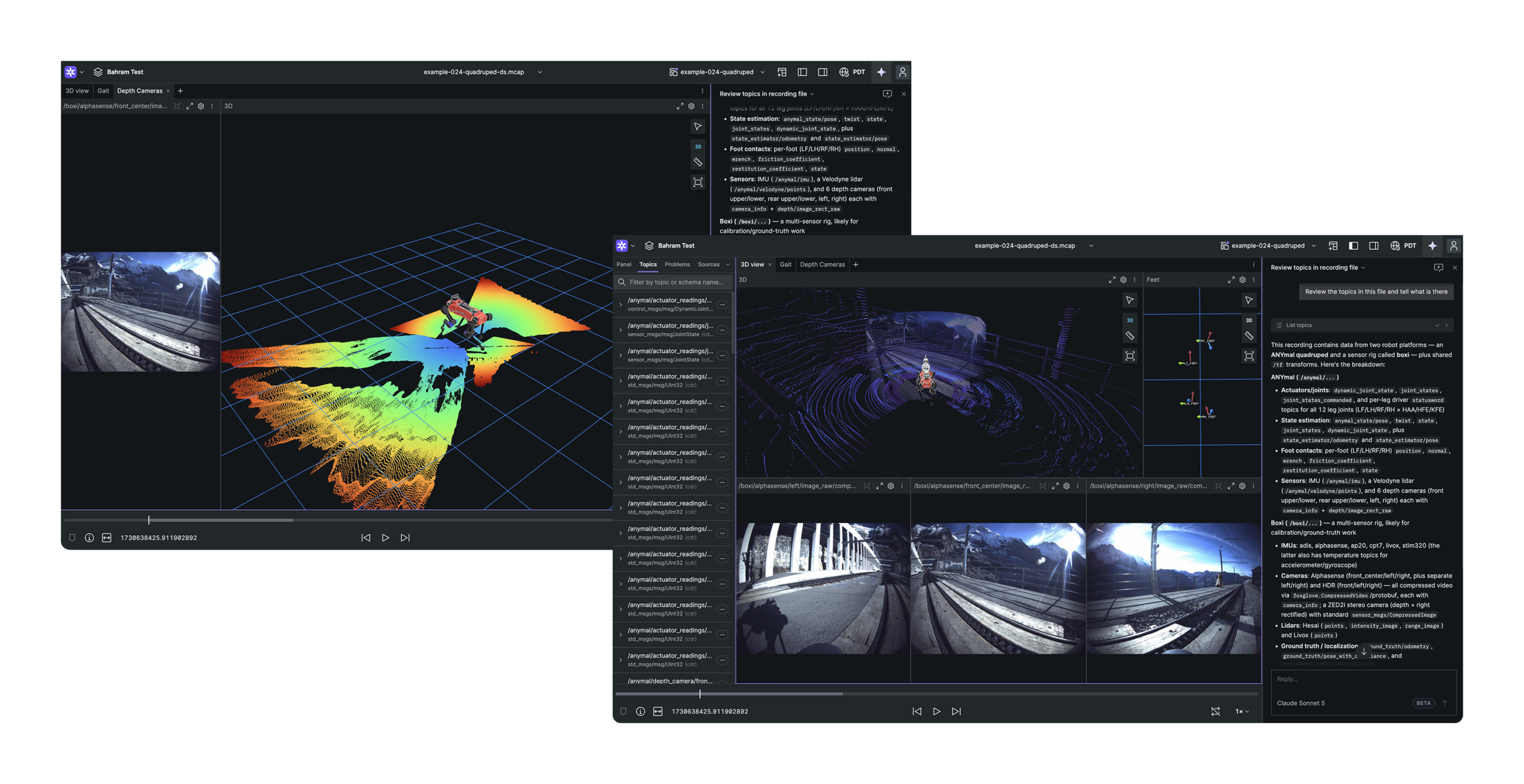
We had a rough prototype behind a feature flag in two weeks, which let us test with real recordings early. The first decision I had to make was where the agent should live. Engineers hate giving up screen space in a visualization tool. They also want to see the agent and all of their data at the same time.
Exploring options.
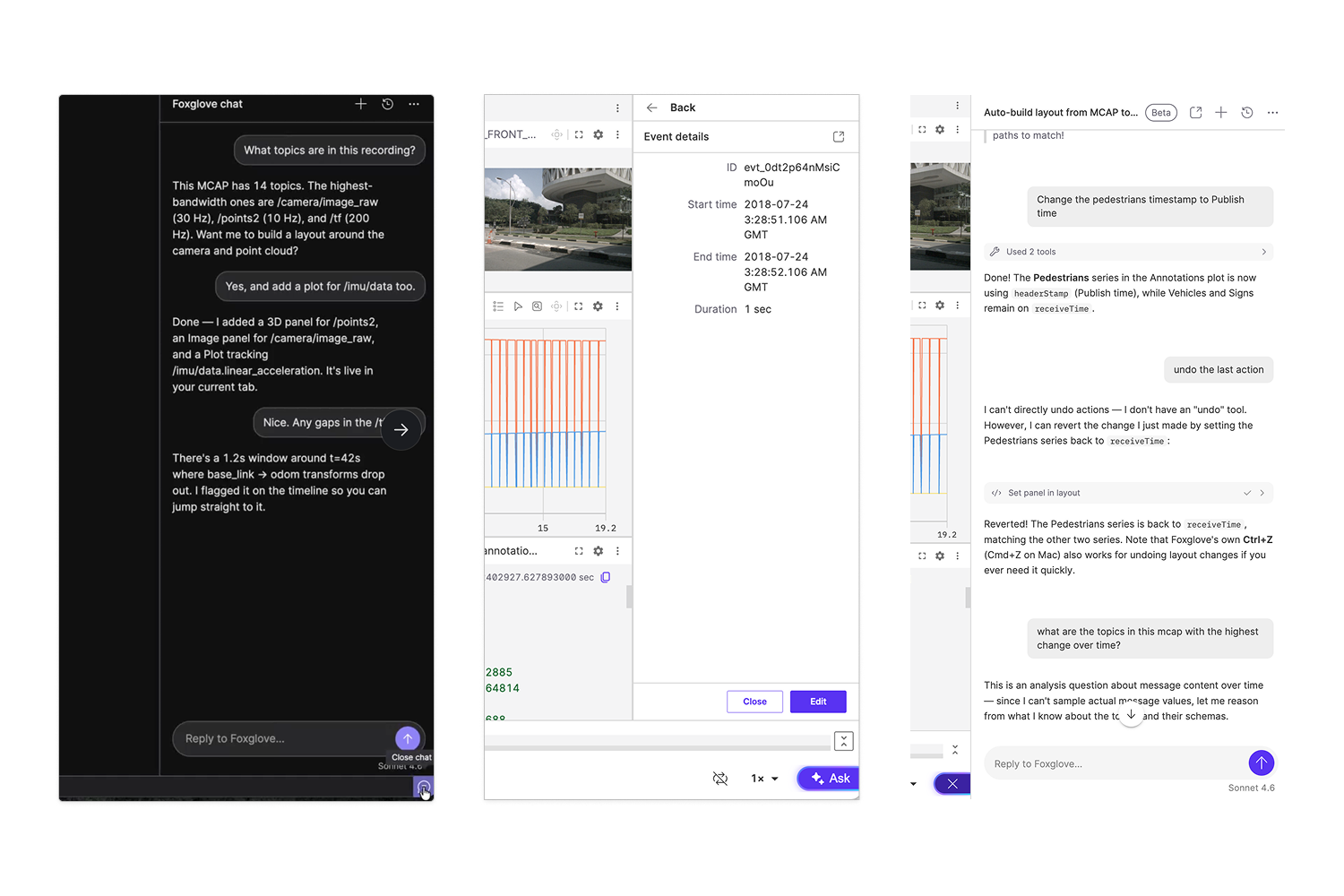
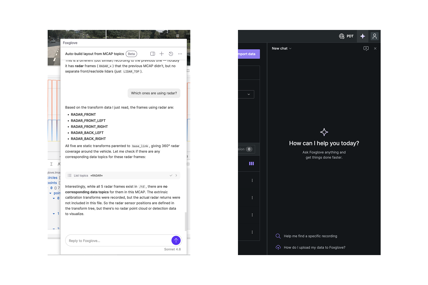
I tried a lot of options for placing the agent inside Foxglove. The first prototype put the agent in an existing sidebar, which hid data. A Linear-style button at the bottom of the viewport wasted space. One idea, generated with AI, put the agent in a tab that sat on top of the playback bar, which was confusing. A floating panel, like you’d see in Adobe tools, offered flexibility but still covered important visualization data. I advocated for adding a new side panel to the canvas. It had its own tradeoffs, but it kept the data visible.
The right side solution.
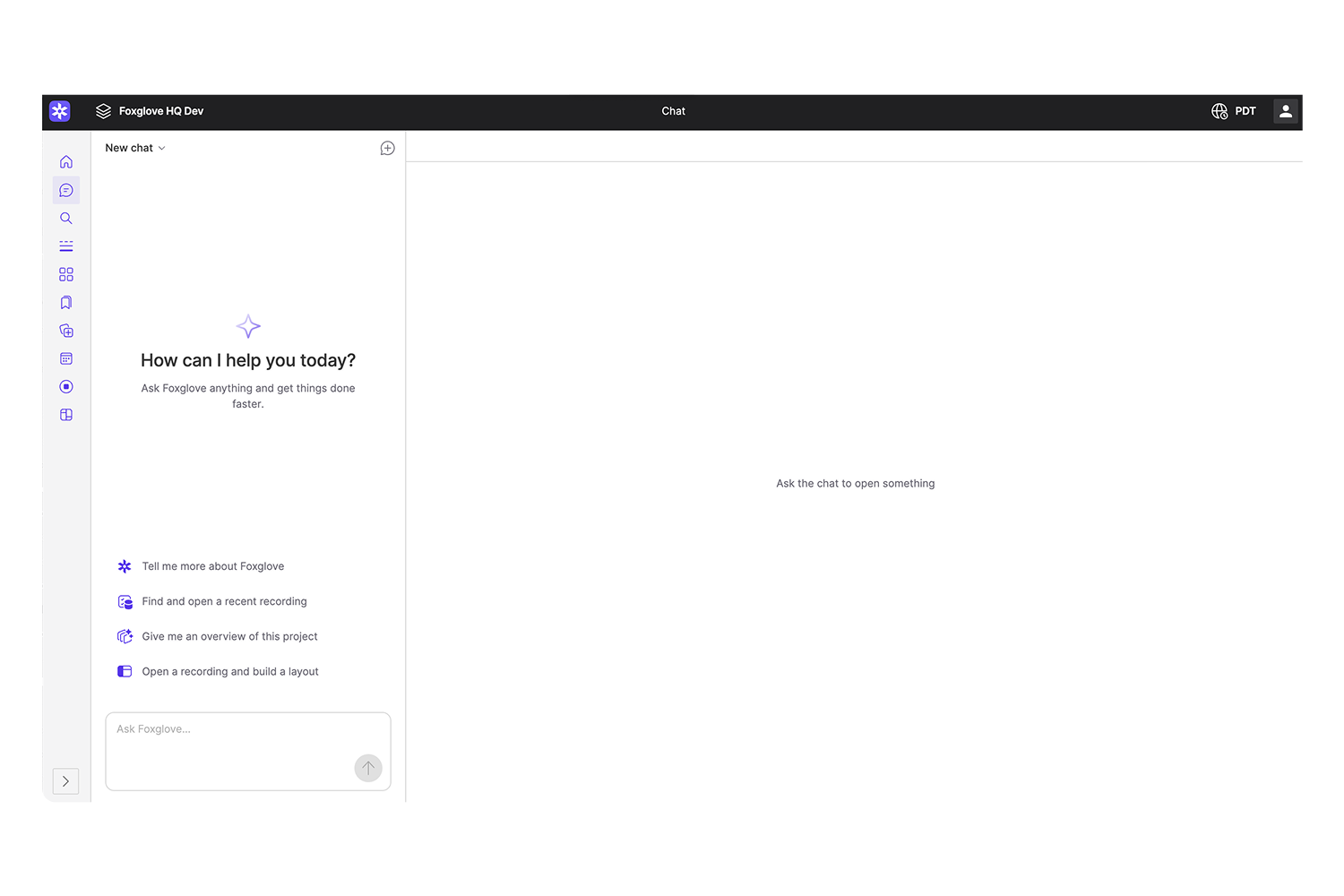
Adrian, our CEO, built a prototype too, with the agent on the left side of the app. I pushed back. A left-side chat reads as an “agent mode,” where the conversation drives everything, rather than an editor where the agent helps you work. Full agent mode wasn’t something we could ship by our deadline, and I didn’t want the UI to promise it. We shipped the right-side panel, and it works across the whole app, in both the data platform and the visualization tool.
What design partners taught us.
We worked with five design partners across agriculture, automotive, humanoids, and logistics to make sure we were building the right UX. They changed the design in specific ways.
We first asked for approval on every action, and users got frustrated right away. Their attention is on the visualization, not the chat, so permission prompts were easy to miss and slowed them down. We removed prompts wherever we could and gave users a reviewable result with undo instead. They also didn’t want a long narrative of what the agent did, so we moved to a short summary with details they can expand.
Search.
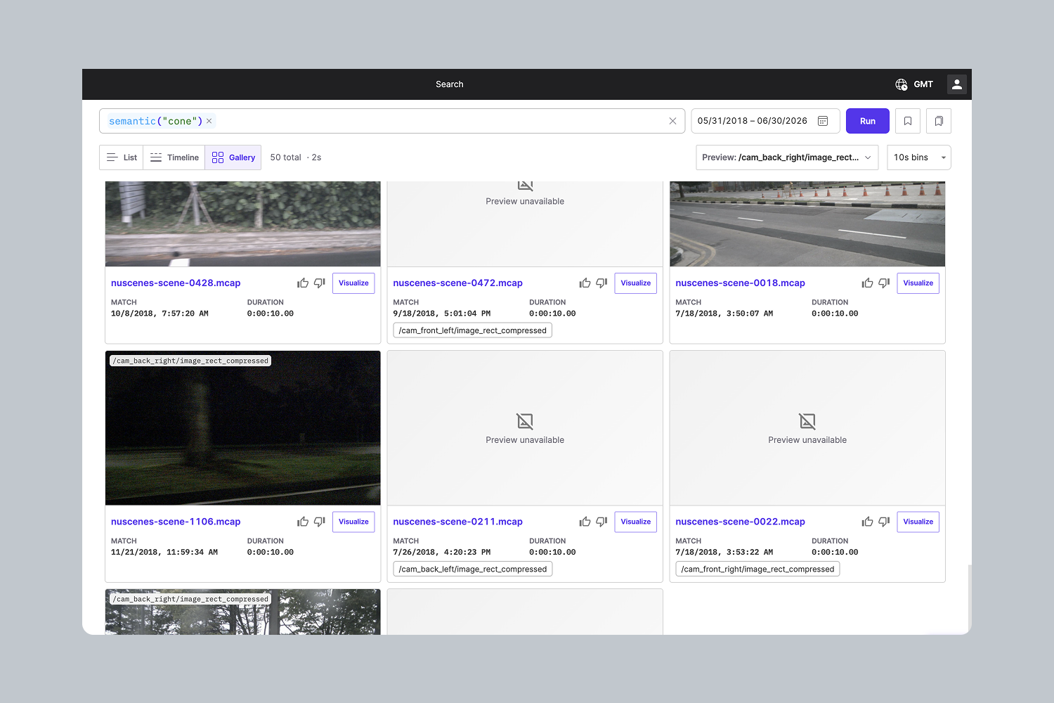
While I was working with the team building the new agent, I was also working with another team building semantic search, which lets engineers find moments in their recordings by describing them. Type “robot arm” and you get every matching moment across indexed image and video topics. The two teams joined forces three weeks before launch and created a unified workflow for data mining and finding off-nominal events with an agent.
Rethinking the search UI.
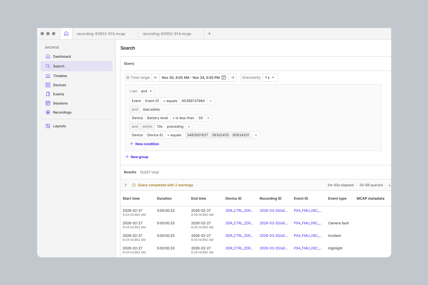
Search needed a new UI before the agent's natural language approach could work. The existing search query builder didn’t play well with natural language and took up too much vertical space. Early prototypes also surfaced so much metadata that results were hard to scan. We replaced the query builder with a simple search box and I added a detail panel to visual search results that moves metadata down a level. Engineers can leave it open and use hotkeys to move through results quickly.
AI-assisted search.
Typing a structured query by hand takes time and is error prone. So we added a toggle that switches the search box into AI mode. You describe what you want in plain language and it returns a structured query you can read and edit. Engineers can also ask the agent to search from anywhere in the app.
Results.
After we launched the Foxglove Agent, building a layout went from the slowest part of an investigation to a simple request. The agent’s layout tools succeed about 95% of the time. That number measures whether the agent’s actions completed, not whether engineers got what they wanted, so the better signal is this: around a third of agent-edited layouts are saved, and very few are reverted. That tells us the agent is reading the data correctly and giving engineers the layouts they want.
It replaces a whole flow for me. Instead of writing scripts or tabbing through all the plot fields myself, it just creates everything for me.
- Engineer at Cobot
Learnings
- Layouts are now easier to make, so there are more of them, and managing them is something we had to address in follow-on work.
- Scope evals before launch, not after. We didn’t, and conversation quality suffered in the first week.
- Sales Engineering and Customer Success make or break a feature like this. It took time to set up customers’ data for semantic search and make them aware the feature existed.
- Adding AI means cleaning up the existing UI too. The team did a lot of last-minute cleanup to make the AI features work with tables and side panels.
Read the launch announcement: Foxglove goes agentic
Team
- Prototype: Ellis Neder (overall UX and agent placement), Sandeep Kini (product), Dakota Pitts-Price (engineer)
- Launch: Ayman Alalao (UI design for conversation turns, thinking states, tool calls and results), and eight engineers across App Foundations and Visualization engineering teams
- Semantic search: Ellis Neder (design), Analese Steverson Pugh (product), and three engineers